case study ︎︎︎ designschool
project overview
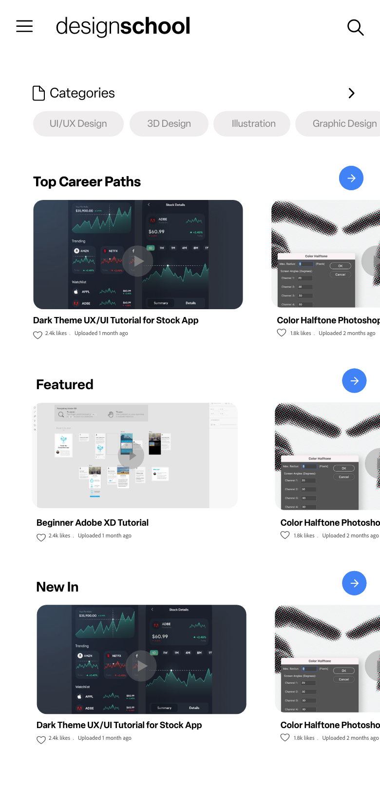
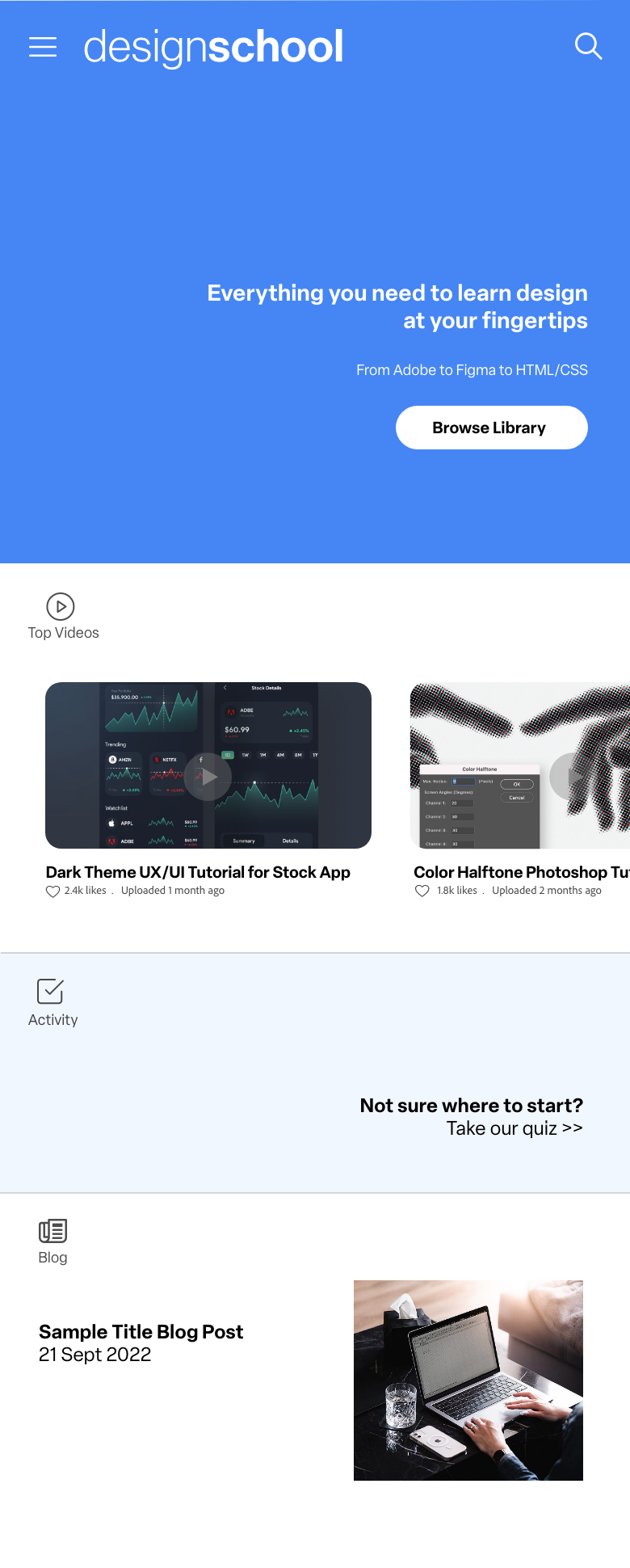
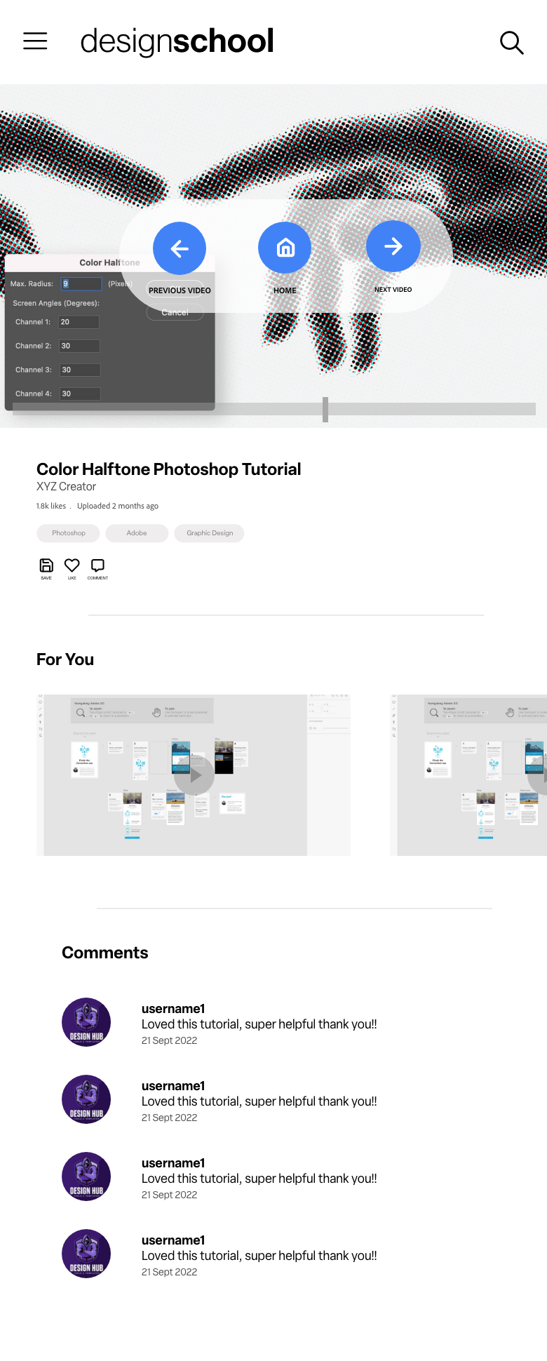
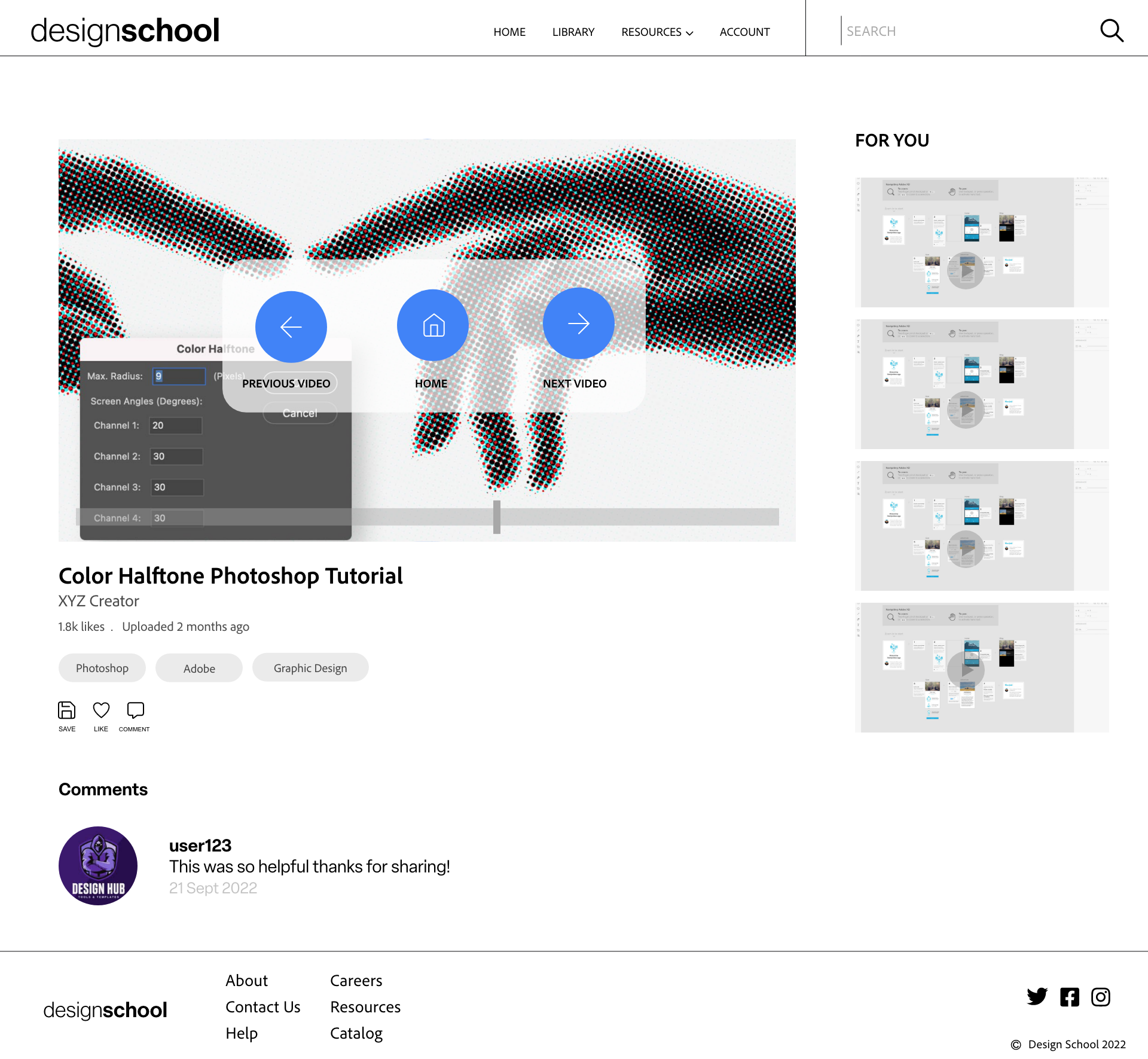
I created a design tutorial website that allows students and professionals to browse videos on a variety of design topics to enhance their skills, find resources, and advance in their careers. I wanted to make it accessible for design professionals to gain knowledge in their field, but also for people without a design background to learn something new. Duration: 4 weeks.

the problem
The web is saturated with video platforms that are cluttered with a variety of content. I wanted to design a space for educational content that allows creative professionals to expand their skill set efficiently - or for people without a design background to learn something new.
the goals
1. Design sleek and straightforward UI that allows users to find tutorials easily.
2. Create an informative video library that is organized and easy to navigate.
3. Provide resources for design professionals to gain knowledge and skills.
My role as the lead UX designer & researcher included: conducting user research, competitive audits, and usability studies. I also created personas, storyboards, wireframes, lo-fi prototypes & hi-fi prototypes.
![]()
![]()
user research
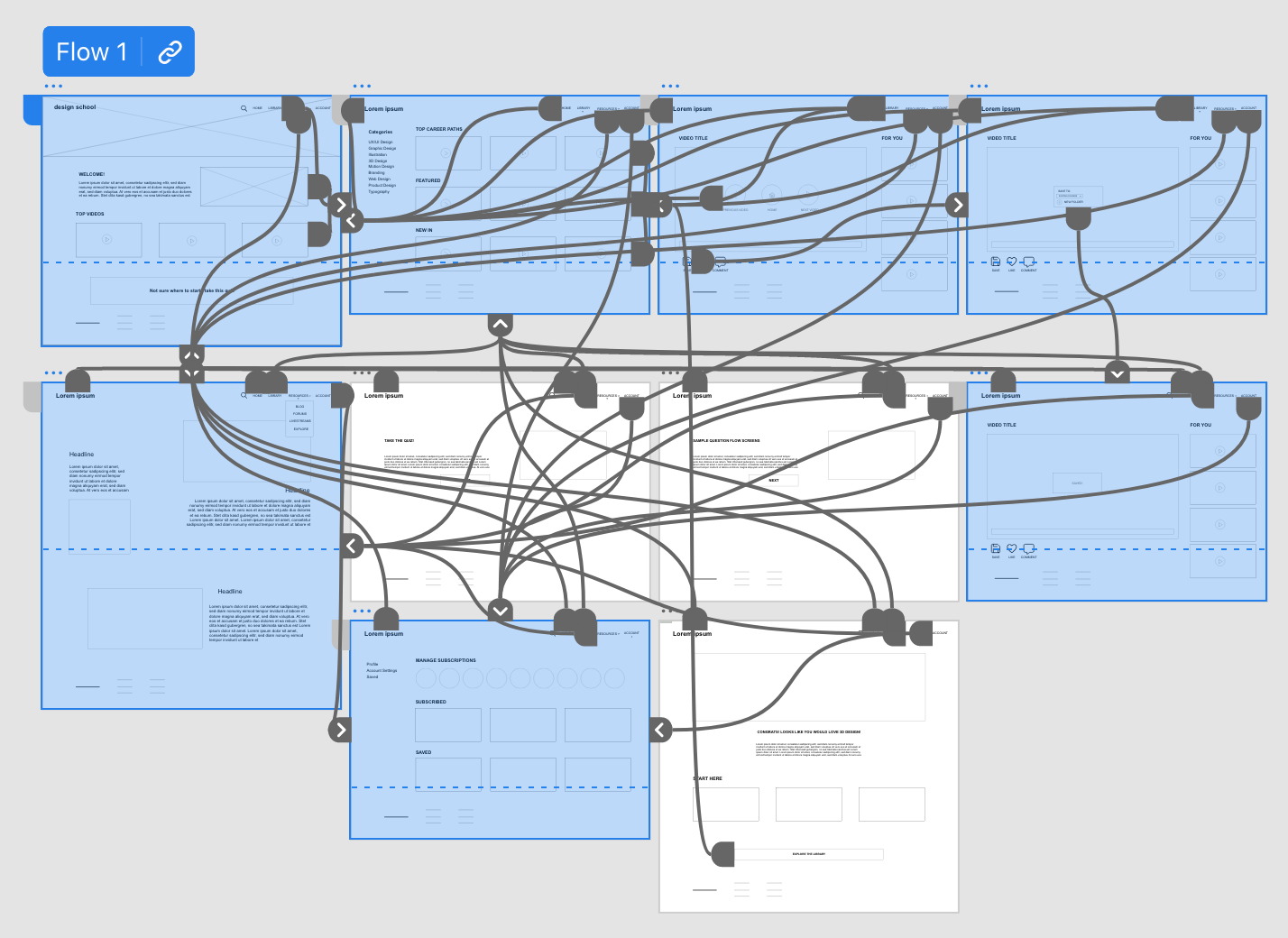
I wanted to ensure the app would indeed solve the user problems I anticipated - while being easy to use and visually appealing. I created some preliminary wireframes of the design flow and began planning my research.
I created personas and began conducting user interviews, which helped me identify key features and user concerns to address in later prototypes. I then conducted a usability study to test KPIs such as: time on task, use of navigation rates, conversion rates, and user error rates. This allowed me to iterate my designs and create a hi-fi prototype that addressed some concerns I discovered during my research.
user journey map
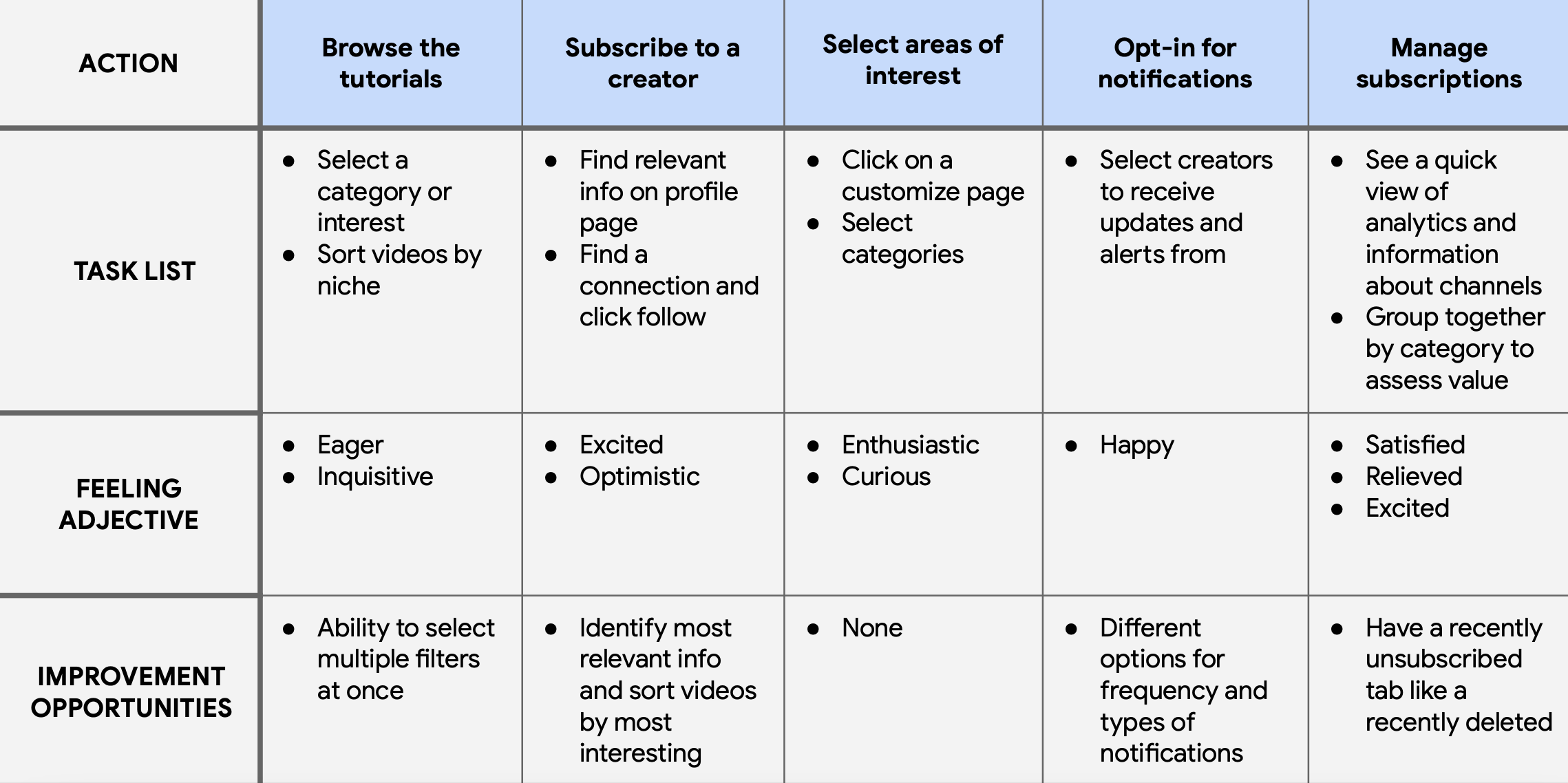
pain points
1. Clutter: Multiple users mentioned YouTube’s home page as an example of UI that feels disorganized and cluttered, with too many options. Users want a clean and minimal layout with relevant information. This allows them to make decisions in less time.
2. Barriers to entry: Users mentioned industry jargon and the cost of online courses as factors preventing them from pursuing an interest in learning design. The goal of this project was to make educationl content more easily accessible.
3. Navigation: With so much information to absorb, users wanted to navigate through a clear user path that starts at their skill and interest level.
lo-fi prototype
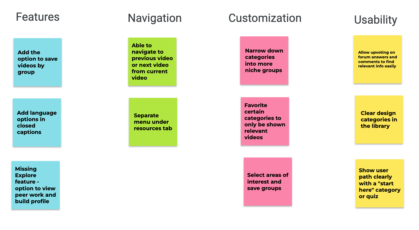
usability study
In my study I found a bunch of areas for improvement. Users had suggestions for better ways to organize the material to make the flow more seamless. Another insight was that users wanted the ability to customize the experience: grouping favorite videos, browsing by a more specific niche, and selecting a starting point and experience level.
final designs
![]()
![]()
takeaways
The goal of creating this website was to make educational content more accessible and easy to navigate for users interested in expanding their careers and gaining new skills. Designing for an end user that aligns with my own interests was a process I enjoyed and learned from as well.
