case study ︎︎︎ arthouse
project overview
Rebrand and redesign for an art buying app that allows users to make informed purchases based on market insights, budget specifications, and areas of interest. I wanted to make it easy for art lovers to discover new artists, find art shows, and begin building their collections. Duration: 6 weeks.
My role as the lead designer & UX researcher included: conducting user research, competitive audits, and usability studies. I also created personas, storyboards, wireframes, lo-fi prototypes & hi-fi prototypes.
the problem
The art world is notoriously non-inclusive. Factors like budget and experience can hinder first time buyers. I wanted to create an app that art lovers find accessible and engaging, full of resources and information to help them enter the art market.
the goals
1. Design sleek and straightforward UI that allows users to find artist information and statistics easily.
2. Allow first time art buyers to discover quality investment pieces and make informed purchases.
3. Provide a simple, linear buying experience.
user research
I wanted to ensure the app would indeed solve the user problems I anticipated - while being easy to use and visually appealing. I created some preliminary wireframes of the design flow and began planning my research.
I created personas and began conducting user interviews, which helped me identify key features and user concerns to address in later prototypes. I then conducted a usability study to test KPIs such as: time on task, use of navigation rates, conversion rates, and user error rates. This allowed me to iterate my designs and create a hi-fi prototype that addressed some concerns I discovered during my research.
challenges
1. Identify characteristics, desires & pain points of the end user.
2. Create a familiar and engaging browsing experience.
3. Encourage curiosity and exploration on the app with intuitive UX.
user interviews

Name: Carmen
Age: 34
Occupation: Creative director
Goals: 1. Find art news and up to date information on artists
2. Community - creating profiles, selecting preferences, seeing what others are buying.
Frustrations: 1. Too much clutter/too many options
2. Redundant steps during checkout
3. Connectivity/refreshing the page during an auction
Insights: Carmen has a visual eye and wants to view photos and information in a clean, aesthetically pleasing way. The presentation of a site being too cluttered will deter her from making a purchase.

Name: Dylan
Age: 28
Occupation: Business owner
Age: 28
Occupation: Business owner
Goals: 1. See market demand & analytics to assess value
2. Browse by category and style
3. Convenience, seamless payments and quick shipping
Frustrations: 1. Lack of responsiveness using auction apps like ebay
2. Lack of information on similar items and market value of artists
Insights: Dylan views luxury purchases (like art) as investments and wants to be able to find good quality investments easily based on style and long term value.

Name: Lyla
Age: 62
Occupation: Financial analyst
Goals: 1. Stay within a pre-set budget
2. Search for specific keywords to save time browsing
3. Use simple and intuitive navigation that feels familiar
Frustrations: 1. Being shown information that is not relevant to her
2. Spending too much time online
Insights: Lyla is a smart buyer who values her time and is not very tech-savvy. She wants to narrow her search to find exactly what she is looking for.
pain points
1. Customization: Users want an experience tailored to their needs and interests. They want to be able to set style and budget options during the browsing process.
2. Clutter: Multiple users mentioned ebay as an example of UI that feels disorganized and cluttered, with too many options. Users want a clean and minimal layout with relevant information. This allows them to make decisions in less time.
3. Not enough data: Users want relevant information that will help them make a large investment purchase. They want straightforward copy without art world jargon.
wireframes & lo-fi prototypes
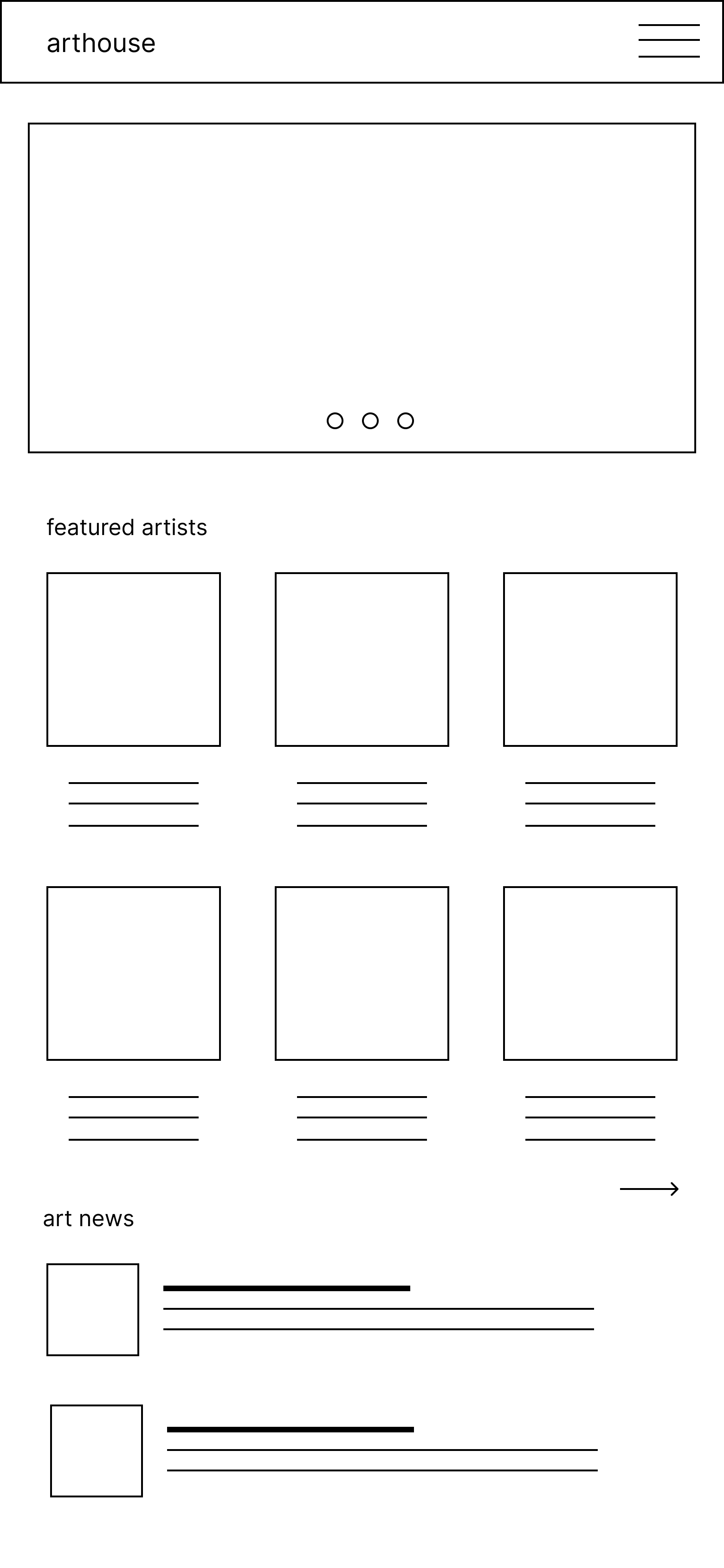
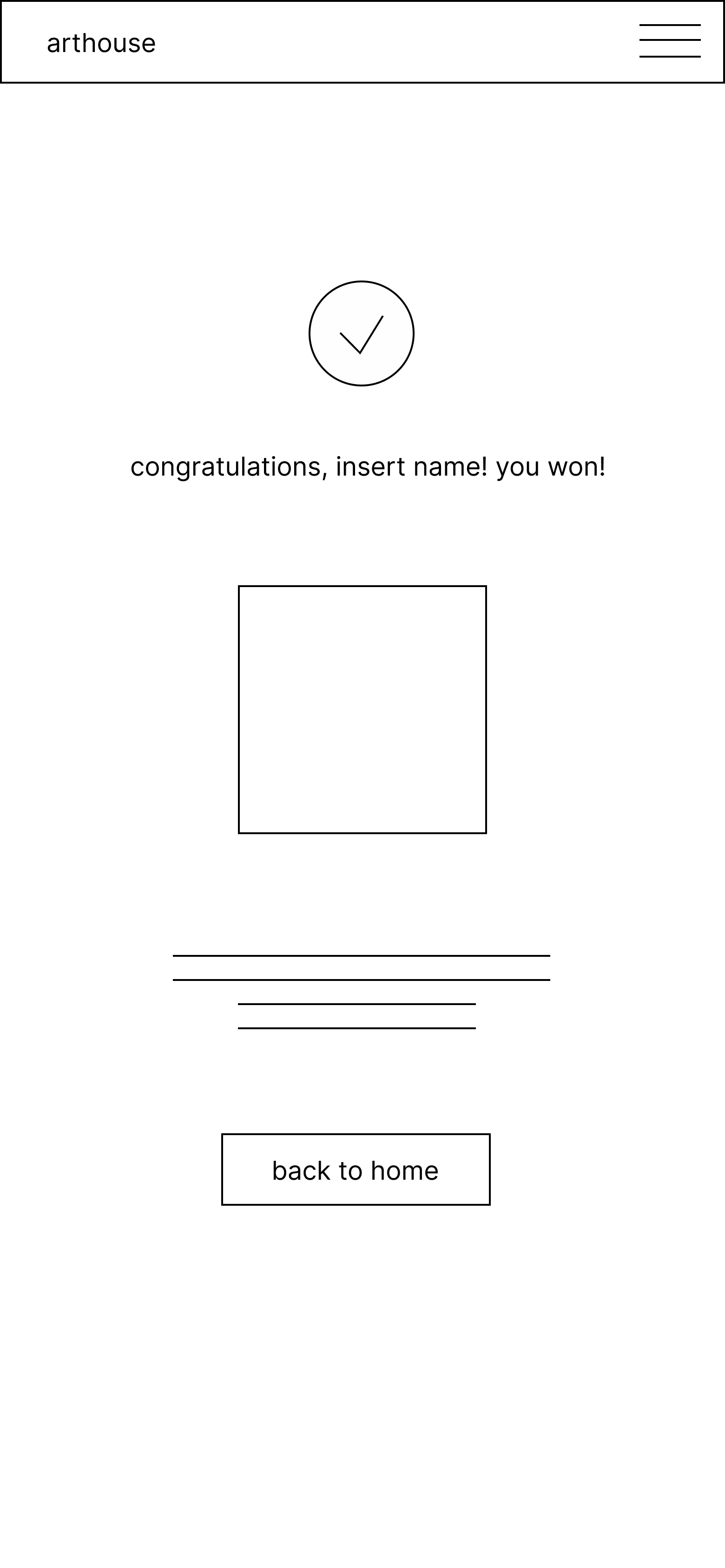


usability study
I surveyed five users and asked them to complete tasks on the prototype. I discovered small problems like broken links and inconsistencies, which were easy fixes.
Areas to improve:
1. Missing steps in the purchasing and decision making process.
2. The need for a filtered search tool allowing users to find specifically what they are looking for and reduce search time.
3. Another request was more information on artist pages so users could deep dive in their areas of interest and decide if they were making a good investment purchase.
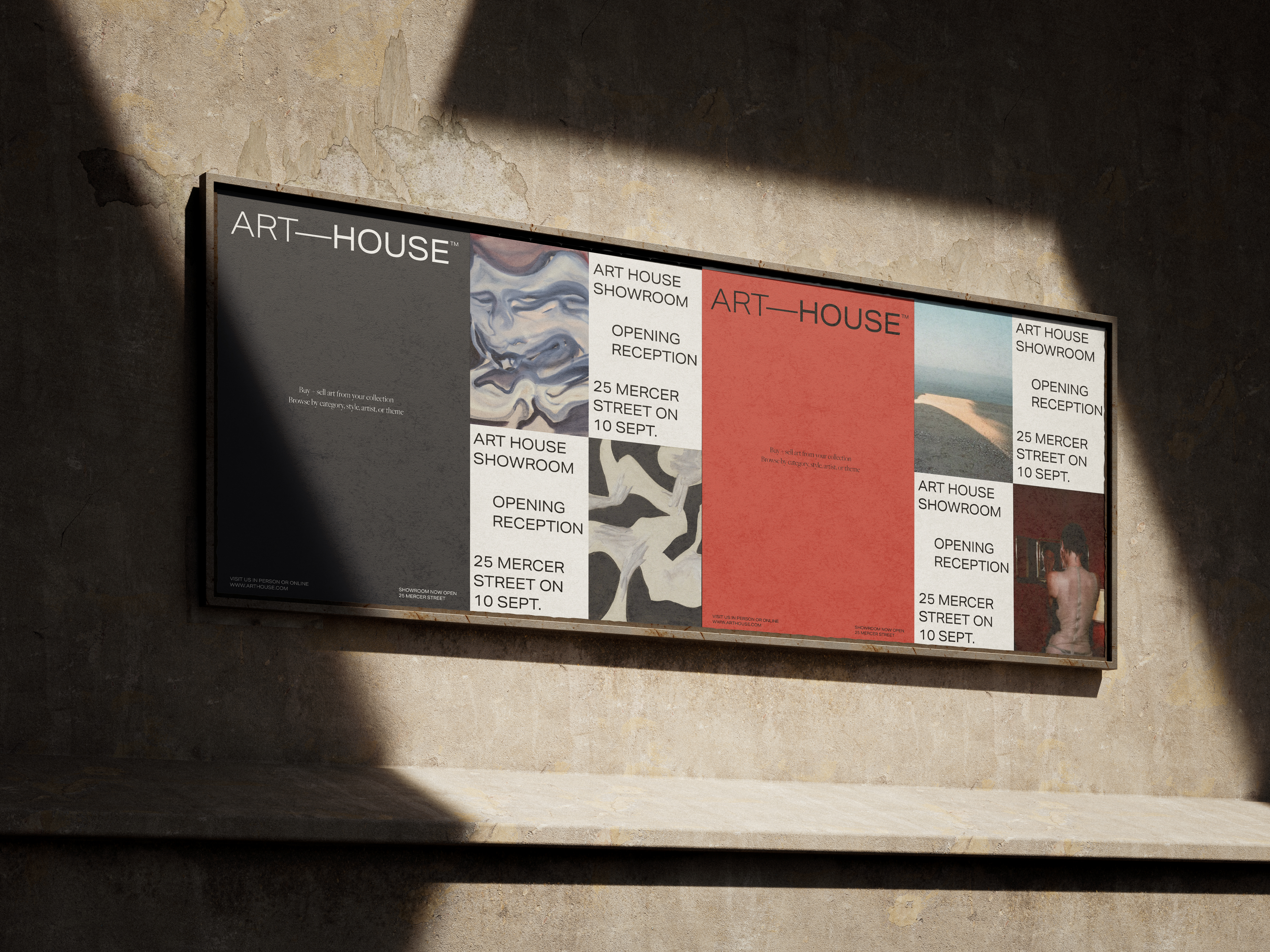
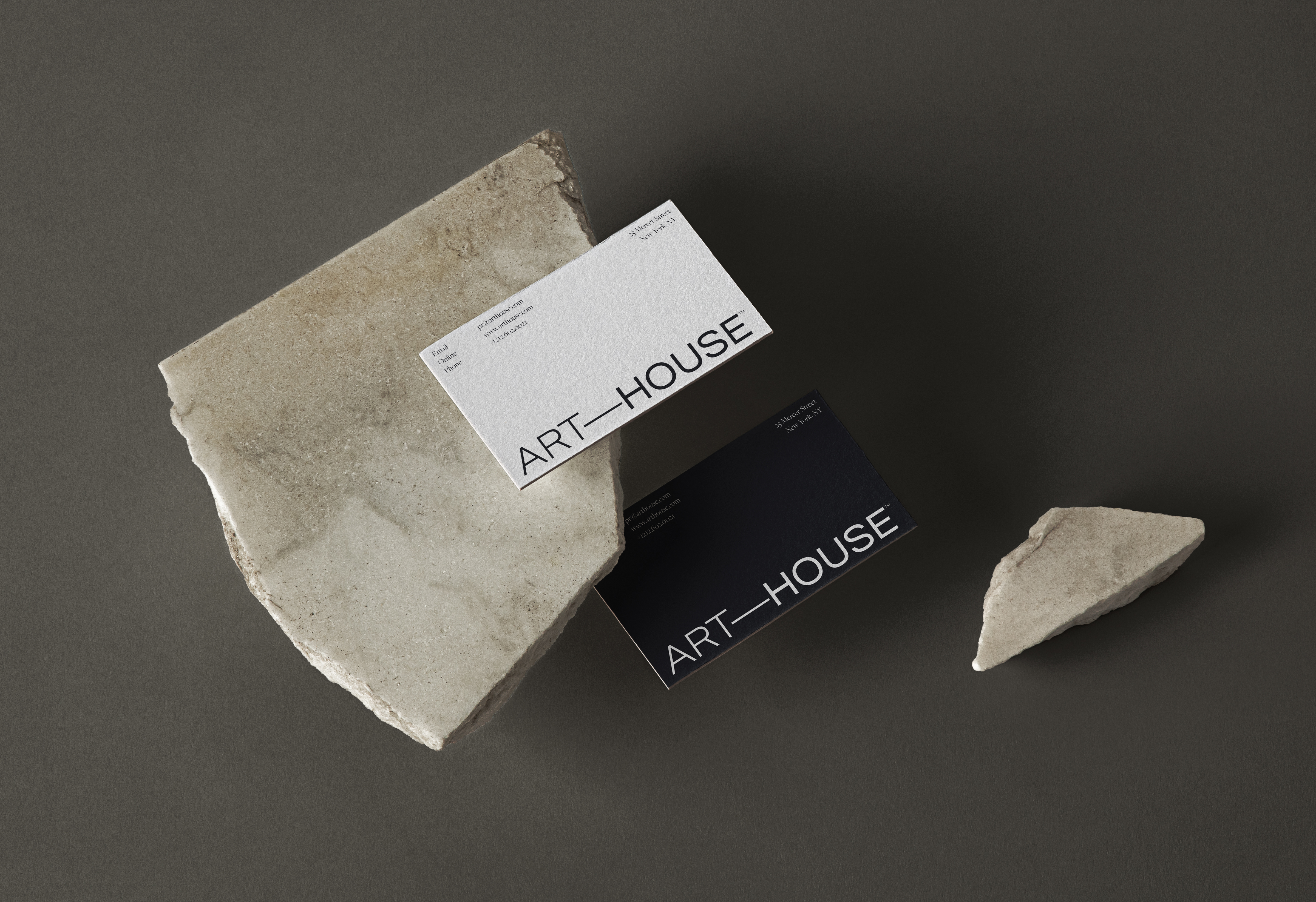
final designs
![]()
![]()
![]()
before
![]()
after
![]()
takeaways
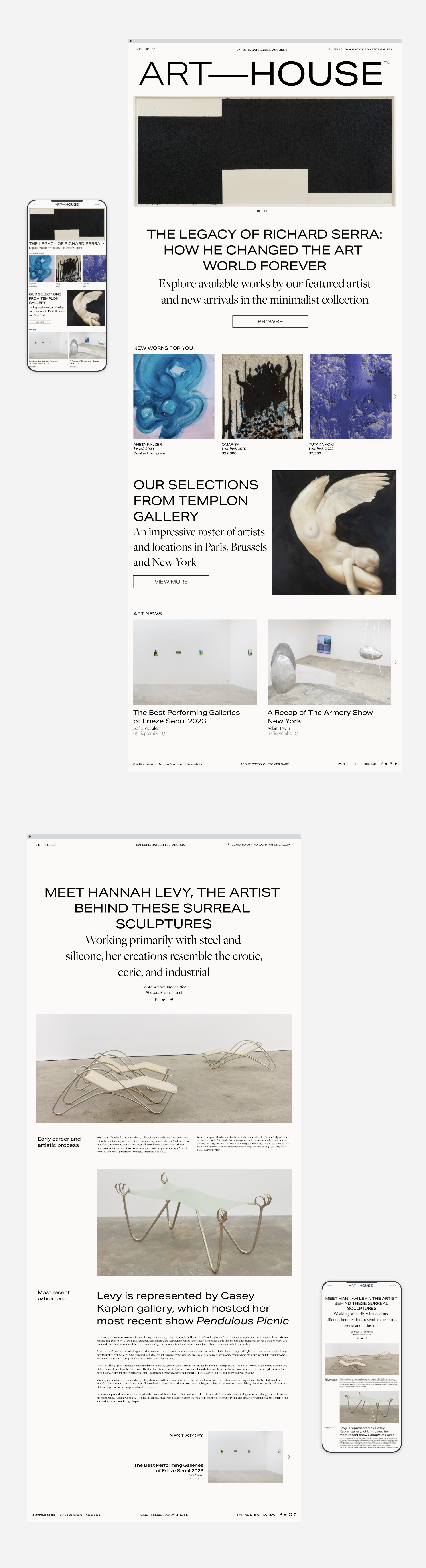
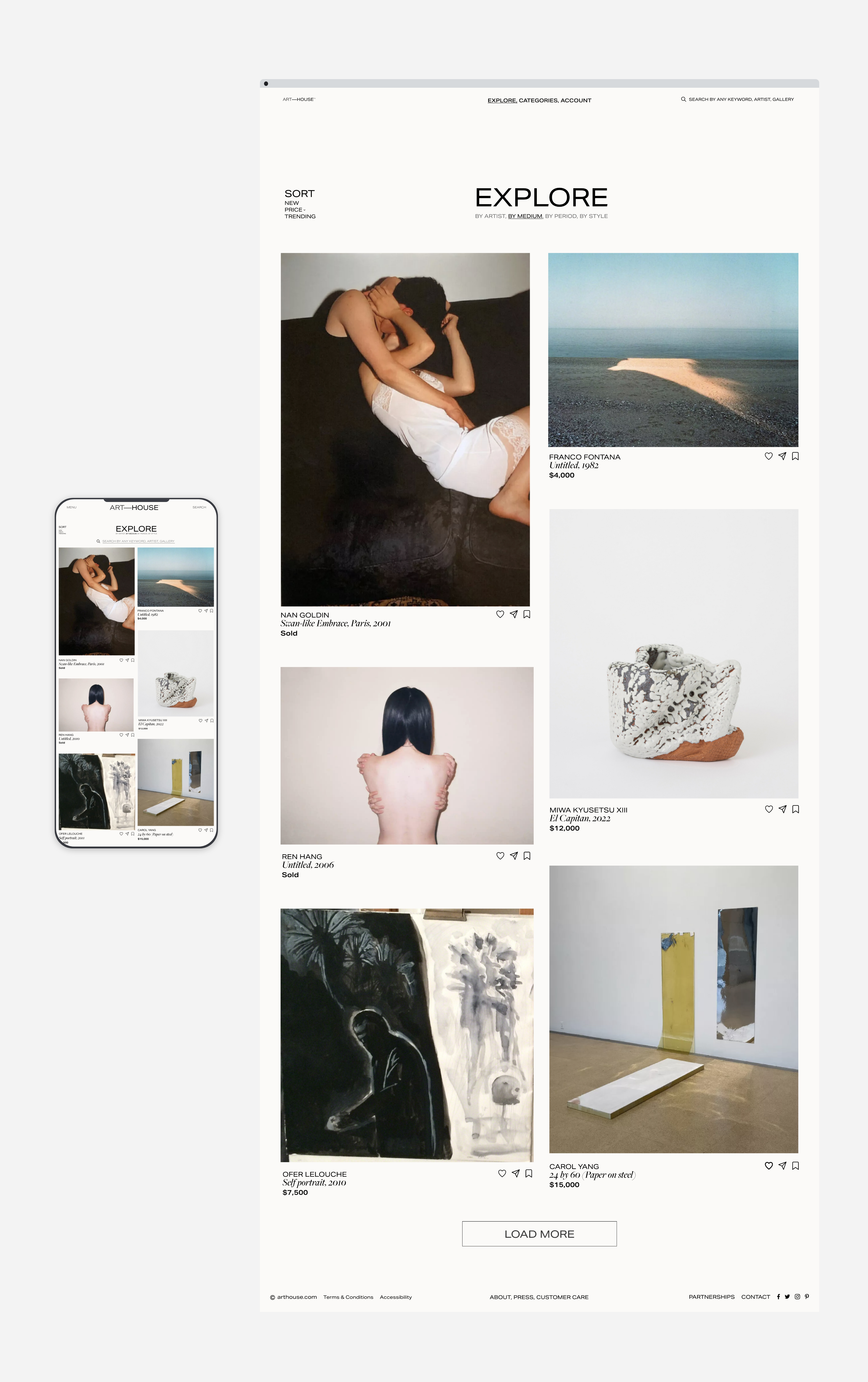


The mission for this app is to help first time buyers enter the art market and make smart investments. Enabling people to invest and explore a passion for art is beneficial on both an individual and societal level. This project included many iterations on visual design to match the luxury market.
Outcomes:
1. Filtered search tool allows users to get specific about what they’re looking for so they only see relevant information. This decreases browsing time and increases conversions.
2. Artist pages include market insights, past auction information, and sales metrics so users can quickly analyze whether they are making a good investment purchase.
3. UI that is streamlined to be visually appealing, making the user experience enjoyable and encouraging more time spent on the platform.